Talk about an experience! This is the best bed and breakfast I've ever been to, and it will be the standard for all future ones.
So often we only think of the digital experiences when we think of interaction design, but ultimately the user experience is much bigger and all encompassing.
I happened to stay in 2 different rooms during my stay at the Raphael Inn on my visit to Gettysburg, PA. Both rooms were meticulously decorated, well furnished, and truly offered the B&B experience of a lifetime.
First is the Evangeline room, which is freshly painted in this gorgeous purple with a theme of flowers and birds. It's perpetual spring in this room
The view from the rocking chair in the room revealed the wonderful ceiling work, giving a modern and refreshing feel.
The white bird cage is a nice accent against the bold paint color, and many butterflies adorn its surface.
On the dresser is an old style radio that can actually play cassette tapes, and the inn keepers provided various music tapes for your listening enjoyment.
Also on the dresser is a nice lamp, with a glass dragon fly hanging off of its edge. With the main ceiling light off, you can really see the line shine through the glass and provide a certain air of magic.
The curtains were hand made with a semi-see through printed layer and a plain layer that allows light in while providing privacy.
There were little above door village house decorations on the door frame between the room and the bathroom, and there was even a mini park bench with a mini giraffe to the right of the dresser.
This is true attention to details!
The main entry way is styled with a Paris cafe theme. In other B&Bs, the breakfast is just basic continental. At the Raphael Inn, be prepared for a feast for both the eyes and the mouth.
On my first day I had an early morning, so couldn't stay for sit down breakfast. The inn keepers made a special effort to pack me a "boxed lunch" that consisted of a sausage & egg bagel sandwich, a chocolate muffin, an apple, a bottle of water, and a bottle of orange juice! I didn't even realized until later the apple was both cored and cut in half for my convenience. Such hospitality!
The next day I was able to enjoy sit down breakfast and was presented with a gorgeous fruit plate before the main course of waffles and bacon arrived.
The Raphael Inn does not take breakfast lightly, and they are very good at it indeed. I think I had the best 4 days of breakfast I've ever had on any vacation I've ever taken here.
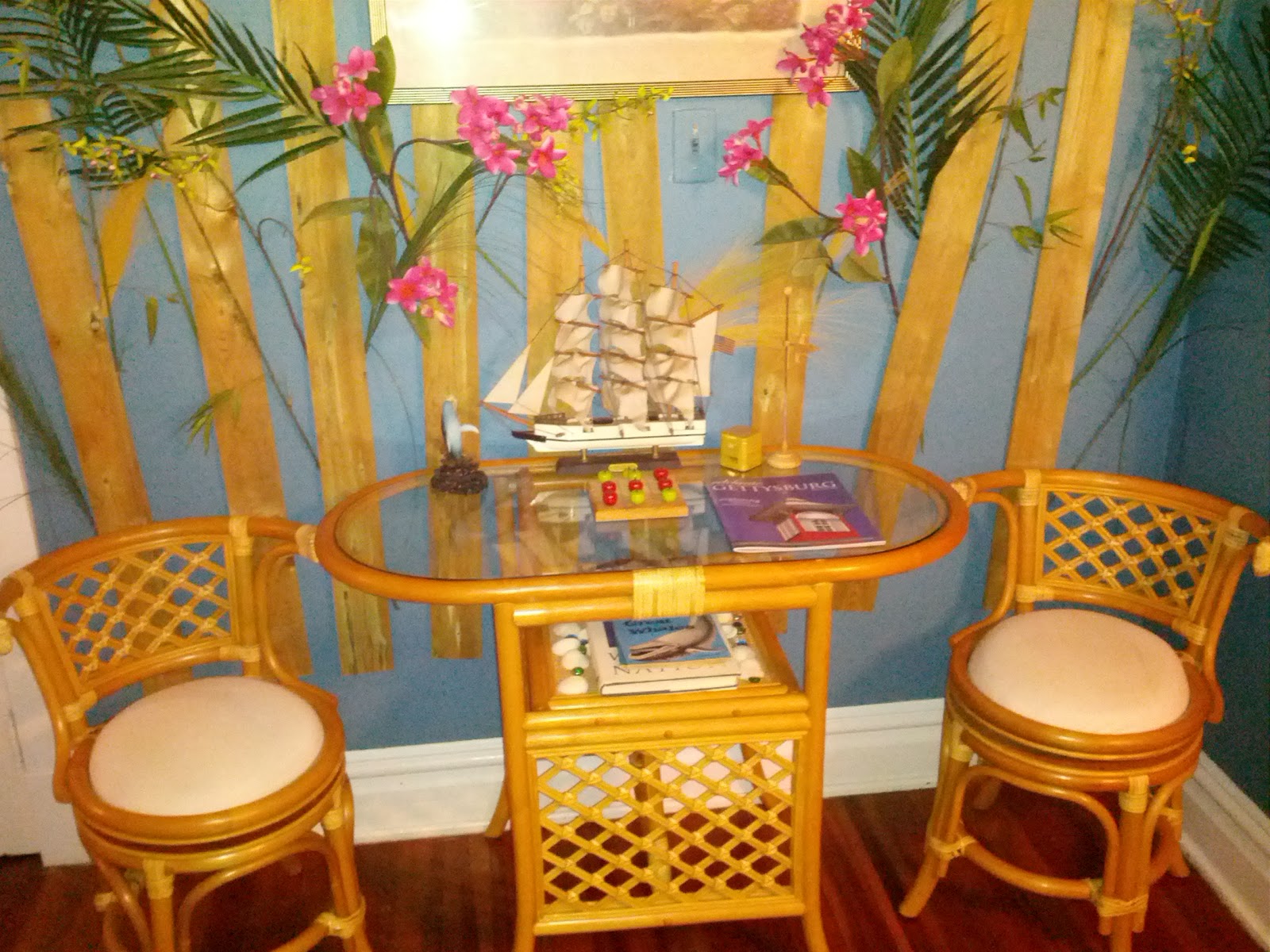
It happened to be with the scheduling of things, I needed to switch to a different room during my stay. I moved into the California Rose Suite which had a king size bed and a futon couch. The bed had a foam layer and I melted right in.
This room has a nautical theme, and used treasure chests as night stands as well as the coffee table next to the futon.
The little sitting area by the bed has mock fences as if on the beach, and the closet had a wall paper reminiscent of being in a wood hut.
There were little "treasures" all over the room, including a small treasure chest filled with "gold coins" (werther's originals).
The book ends on the coffee table were nautical themed, and even the books were seaworthy adventure books like Robinson Crusoe, and Treasure Island.
Every last detail was accounted for, and my experience at the B&B really could not have been better.
While I realize being a designer means I noticed a lot of details that might have been missed by most visitors, it is these details that not only complete the experience, but brought it to a new height unmatched by others.
This is true of all user experiences. The details really do count. Often times, less is more. Do fewer things, but do them really really well. Cross all the T's and dot all the I's. Completing the details will complete the user experience and bring delight. In the end, who wouldn't want to delight their users?