Saturday, September 1, 2012

Replacing the Wait Staff with an iPad

By chance I had a layover in MSP (Minnesota / St. Paul) and my gate was right next to a new concept restaurant with iPads at every single table, apparently the work of OTG Management (I have no relation to them - just happened by).

My initial thought was it's kind of cold. This restaurant is basically replacing the wait staff with iPads. We, as a society in this modern digital age, could use more human contact, not less. We're so attached to our devices, it's almost as if we are electronic devices ourselves.

I was going to sit and watch while I wait for my flight, but then the designer in me thought it might be better to go and check it out, find out how they've set it up and see what the interface is like. So I sat down looking at one of the beautiful food shots on rotation and got started with my electronic wait staff looking for the cheapest thing I can buy to justify sitting at a space and taking pictures as I go.


They rewired the iPad so you can't get to the standard controls. The Home button retrieves their special customized home screen and dock.


I tapped on "Your Flight" and it kindly asked me for info about my current flight in order to track its status for me. Gave me some info on the destination weather, etc as well. It wasn't "sticky" though, and as soon as I finished my order and was idle long enough for the slide show to kick in, it lost the flight info. It would have been nice for it to remember, or somehow have the user indicate when he/she is leaving the table (which would also help the wait staff know when to clear the table), before clearing the flight info. Since it cleared it for me, I don't know if it would have given me some kind of alarm when my boarding time was near. That would be a nice feature.


Then I proceeded to go browse the menu. Having great food photography is key in this case, since these photos are ultra high def on the iPad, and never looked this sharp in an actual printed menu.

The menu certainly looked appetizing, but the prices in this case were kind of high for my taste.


After you browse into a category the menu pop over gives you quick access to other categories, but strangely stays open after you make your selection. Maybe it's done on purpose to reduce the sticker shock since you can't see the prices when the menu is open.


After awhile I finally settled on some over-priced herbal tea since it's evening and it was more affordable than dessert. The system smartly does some cross selling as I proceed to check out.

You have to pay for your order before it gets submitted, which I understand. But gratuity is included in the payment, but I haven't interacted with any wait staff. How can I determine the level of service and how much tip to give? It's defaulted to 18% and there's no option to provide a custom value besides the 15, 18, and 20 that it gives you.


Then it steps you through paying using the card swipe stationed at each table. No cash accepted.


When the transaction is complete, it asks if you would like to receive an email of the receipt. No printed receipt seems to be available at the table. I was reluctant to provide my email since I don't know if it'll mean getting spam. They should put some kind of notice on the screen about that to reassure users, especially since you cannot opt out of getting the receipt via email. What if you don't have email?


A few minutes after all of this, my tea arrived. This was the first time I interacted with a wait staff (they have been walking around asking patrons if they needed any help in the mean time).


I was left wondering if it was worth 18% for the wait staff to bring me the tea and tell me to let it steep a few more minutes before enjoying it. Seems like a premium. The restaurants don't need as many people to work the tables, though yes, they had the up front cost of buying all those iPads. But over time it more than pays for all the staff they don't need to hire and schedule/coordinate work shifts.

The wait staff doesn't need to actually take anyone's orders. Instead of selling food and offering beverages they turn into iPad app explanation staff and they make at minimum 15% on each transaction. Not that I have anything against the wait staff earning more money, but this just doesn't seem quite right for some reason.

Well, it was an interesting experience if nothing else. Apparently this is popping up in major airports all over the country, including the Dunkin Donuts in BOS.

At the rate we're going, The Matrix will be here before we know it.

Bye humans. Better plug in.

Friday, August 31, 2012

Hand Model

It's not every day I get to say my hands are being seen by thousands of strangers in the iTunes app store. But that's what I get to say today! The eDrawings Pro iPad App launched and my hands were used for the shot holding the iPad and app. Maybe I have potential as a hand model if this user experience thing doesn't pan out. :-)

Thursday, July 12, 2012

LEGO Mindstorms NXT Icons

One of the major differences between working for a product company and a consulting company (at least for web consulting) is the time scale between design and when the design goes live.

I had done some simple icon design work in support of the LEGO Mindstorms NXT support package for MathWorks Simulink over a year ago.  The idea was to provide icons that help identify each Simulink block which can be sensors or hardware, depending on the system model's need.  After my departure I had no idea if the icons were ever launched.

I just found out it did go live with the March 2012 release and grabbed the screenshots off of the LEGO MINDSTORMS NXT Support from Simulink product information page gallery.

There's also a page on MatLab Central: Simulink Support Package for LEGO MINDSTORMS NXT hardware. It has a screenshot of the library too.

I'm so glad to finally see the work in the product and out in the world. These icons were created as a stop gap measure since we were resource and schedule constrained. I wasn't sure if they would be placeholder icons until someone else gets to them, or if they will actually go out with the product. 

I'm glad it's the latter. It's always such a joy to see your work out in the world. Here's a clearer look at each of the icons designed. 

Wednesday, July 11, 2012

Post-It Art: Ms. Pacman

It started when I tried to accomplish something in a software 3 times in a row and failed. Out of frustration I went looking for a creative outlet.

Earlier on I had purchased some small square Post-It notes, so I thought maybe I can add to the wall that already has a giant thumbs up sign on it with some more Post-It art.
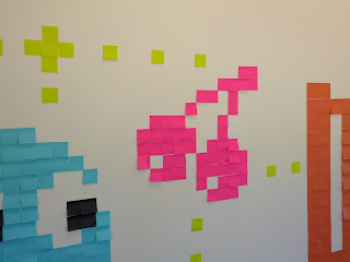
I did Ms. Pacman first.  I had a limited supply of colors and my initial idea of doing the Mario 1-Up Mushroom wasn't going to work since I had no black squares to work with.

One of my colleagues colored a white square in with a black sharpie to create the single black mole for Ms. Pacman.
After lunch and some meetings, I came up against another road block, so I went back to the wall and added the blue ghost and cherry with the little "white" dots.

White wasn't going to show up on the white wall so green was used instead. I also originally did the blue ghost when it's in "edible" mode, but it was a bit small and the resolution wasn't fine enough to reveal the squiggle of its mouth.
At the end of the day, I went back and replaced the blue ghost with a "normal" one that is bigger in dimension, so I could have the resolution I needed to give it a proper shape and also proper eyes.

With this version, I didn't need the mouth, which worked much better. Using the same technique as earlier, a colleague helped me color in a few white squares as black for the eyes.
Connecting the dots (literally) with the original thumbs up on the wall, that was done by my colleague many weeks before.
Finally, another colleague mentioned it might make sense for the ghost to be looking back at Ms. Pacman. I agreed and we went about moving the eyes so it looked to the upper left instead of the bottom right.  A master piece in 8-bit pixels, if I may say so myself. :)


Saturday, July 7, 2012

B&B: Raphael Inn


Talk about an experience! This is the best bed and breakfast I've ever been to, and it will be the standard for all future ones.

So often we only think of the digital experiences when we think of interaction design, but ultimately the user experience is much bigger and all encompassing.

I happened to stay in 2 different rooms during my stay at the Raphael Inn on my visit to Gettysburg, PA.  Both rooms were meticulously decorated, well furnished, and truly offered the B&B experience of a lifetime.

First is the Evangeline room, which is freshly painted in this gorgeous purple with a theme of flowers and birds.  It's perpetual spring in this room

The view from the rocking chair in the room revealed the wonderful ceiling work, giving a modern and refreshing feel.

The white bird cage is a nice accent against the bold paint color, and many butterflies adorn its surface.
On the dresser is an old style radio that can actually play cassette tapes, and the inn keepers provided various music tapes for your listening enjoyment.

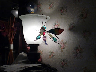
Also on the dresser is a nice lamp, with a glass dragon fly hanging off of its edge.  With the main ceiling light off, you can really see the line shine through the glass and provide a certain air of magic.
The curtains were hand made with a semi-see through printed layer and a plain layer that allows light in while providing privacy.

There were little above door village house decorations on the door frame between the room and the bathroom, and there was even a mini park bench with a mini giraffe to the right of the dresser.

This is true attention to details!

The main entry way is styled with a Paris cafe theme.  In other B&Bs, the breakfast is just basic continental.  At the Raphael Inn, be prepared for a feast for both the eyes and the mouth.

On my first day I had an early morning, so couldn't stay for sit down breakfast. The inn keepers made a special effort to pack me a "boxed lunch" that consisted of a sausage & egg bagel sandwich, a chocolate muffin, an apple, a bottle of water, and a bottle of orange juice! I didn't even realized until later the apple was both cored and cut in half for my convenience.  Such hospitality!
The next day I was able to enjoy sit down breakfast and was presented with a gorgeous fruit plate before the main course of waffles and bacon arrived.

The Raphael Inn does not take breakfast lightly, and they are very good at it indeed. I think I had the best 4 days of breakfast I've ever had on any vacation I've ever taken here.
It happened to be with the scheduling of things, I needed to switch to a different room during my stay.  I moved into the California Rose Suite which had a king size bed and a futon couch.  The bed had a foam layer and I melted right in.

This room has a nautical theme, and used treasure chests as night stands as well as the coffee table next to the futon.

The little sitting area by the bed has mock fences as if on the beach, and the closet had a wall paper reminiscent of being in a wood hut.
There were little "treasures" all over the room, including a small treasure chest filled with "gold coins" (werther's originals).

The book ends on the coffee table were nautical themed, and even the books were seaworthy adventure books like Robinson Crusoe, and Treasure Island.

Every last detail was accounted for, and my experience at the B&B really could not have been better.

While I realize being a designer means I noticed a lot of details that might have been missed by most visitors, it is these details that not only complete the experience, but brought it to a new height unmatched by others.

This is true of all user experiences. The details really do count. Often times, less is more. Do fewer things, but do them really really well. Cross all the T's and dot all the I's. Completing the details will complete the user experience and bring delight.  In the end, who wouldn't want to delight their users?

Saturday, June 2, 2012

Wally the Green Monster Pillow Pet


Is there really anything to say besides I'm envious of those who have the cool job of designing all the variations of pillow pets out there?  In this case, it's Wally the Green Monster - the Boston Red Sox mascot.

I happened to go on a tour of Fenway Park and we were told to wait in the team store before it started.  As soon as I saw this I knew I wanted it. After 20 min of roaming the store, I found myself circling the display, so I knew I needed to buy it.  It's fun, and it's functional (as a pillow)!  Form AND function! Imagine that! :)

Tuesday, April 24, 2012

M&M Merchandising

So I must admit that I'm an M&M character fan. I'm fairly sure, if I dig through my art portfolio, there's a blue M&M (maybe it's yellow) somewhere in there. Actually, thinking about it, it might even have been a middle school art poster (in which case it was most definitely yellow and not blue).

Anyway, I've always been a fan. I think things that are round with a face on it are cute, and they're even funnier when they talk and are personified.

This shouldn't be all that surprising, after all, the baby-face bias is a well known design principle (things that look like babies will naturally appeal to us - it's an evolutionary instinct - after all, if we found babies ugly, we wouldn't protect it, and the human race wouldn't be able to continue).

Therefore, when I walked into the M&M World store in Time Square and saw this giant Blue M&M dressed like Elvis rotating on a disco floor I couldn't pass up the chance to really act like a tourist and get my picture taken with it.

I have to bow to the absolute genius of the toy designers when I saw the Lady Liberty M&M dispensers in the store.

Of course it makes sense to have a Lady Liberty dispenser when you're in NY.  Integrating it with the Green M&M, which, up until the beginning of this year, was the only lady M&M, is pretty ingenious.

I actually saw this on a previous visit, but didn't buy it because (1) I had not seen the real Statue of Liberty yet (2) if I had an M&M dispenser, then I would be eating lots of M&Ms.

But since I made it to the real Statue of Liberty this time, I could justify the purchase.

This is the genius of M&M merchandising. I'm envious of the toy designers who were in the position to create such an ingenious product. If only I trained in industrial design, I might have had a shot at working as a toy designer for them! Oh well, I'll admire with my pocket book instead.

Sunday, April 22, 2012

Empire State Building Project Gantt Chart

You would think that growing up in southern NJ means I have had plenty of opportunities to go visit NYC and all of its attractions. But somehow I have never made it to the main ones just about every other NYC tourist have seen, such as the Empire State Building.

I finally had a chance to make it there on a weekend trip to NYC, and is immediately greeted with this large display in the lobby.

It was completed in 1931, at that time, at 102 stories high (1454 ft), it was the tallest building in the world. It stood as the tallest building in NYC until the World Trade Centers were built. It was once again the tallest building in NYC after the twin towers came down during the 9/11 attacks.

So during my visit, it was the tallest building in NYC.  I did attempt to go out to the viewing deck a few times. But the weather was stormy so I couldn't stay out there long. It was too windy and the visibility was almost none.

What I found most fascinating, however, is the project schedule showing the progress of construction.

I know, what an interaction design geek.

I was in awe! To see a non-computer generated project Gantt chart! This is pre MS Project and if you look closer, you'll notice it's all art deco font as well.

An original data visualization! You hardly ever see any of this nowadays, not ones that were not generated digitally.  This format of presenting information is obviously very successful for the type of information it is communicating, which is why we still see Gantt charts today for communicating project schedules and progress.

What a gem for the UI/UX eye! Ok, enough geeking out, back to being a tourist. ;)


So as I made my way up toward the top, a mom with 3 kids were in front of me.  We came across a guy in a safari outfit who said to the family that they should feel free to go up and take a picture with the King Kong (and that it doesn't cost anything).

The mom saw no harm in it and sent the 3 boys up. They got into position to take the picture, and the King Kong said "Boo!" sending them screaming. :D

Of course, that means I absolutely had to have my picture taken with King Kong.  He does look a lot like a statue instead of a person in a King Kong costume. He certainly stood still enough earlier on that you really thought he was just a statue. What great fun!

After I made it to the top and had my fill of being blown around by the gusting rain and wind, I made my way down. In the elevator was this marble silhouette of the building. Really classy!